CopernNet : Point Cloud Segmentation using ActiveSampling Transformers
In the dynamic field of railway maintenance, accurate data is critical. From ensuring the health of ...


Published on: September 1, 2020
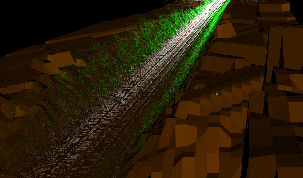
It has been some time since we finished the vegetation detection algorithm for Infrabel. The algorithm has proven its reliability so far, in that it detects both the presence and the height of the vegetation in an accurate way.
However, using the results of the algorithm to actually improve vegetation management turns out not to be a trivial task: vegetation management is surprisingly complex, as managing vegetation doesn’t simply mean cutting all growth that goes above the limit. One needs to take into account several more elements, such as environmental policies and laws, limited budgets, contracts with third parties, railway safety and accessibility, and the fact that Infrabel doesn’t always own the land on which the vegetation grows.

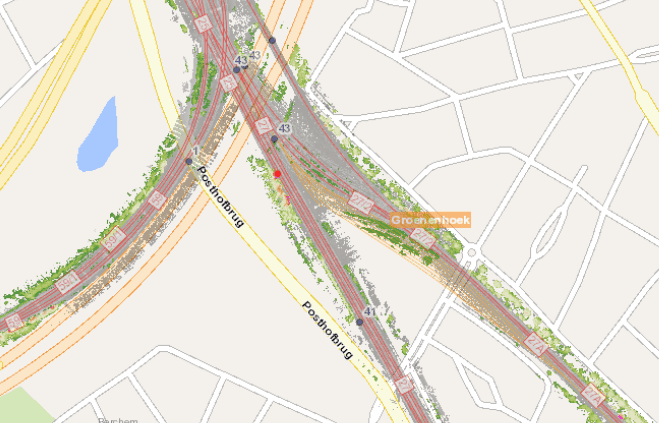
A first thing we put in place was a good and simple visualization of the algorithm. So far, throughout the first phase of the project, we had mainly been working with animated 3D visualisation, which is perfect for validating the result of the algorithm, but is not suitable for surveying large amounts of railway banks.
So we decided to visualize the vegetation growth on a (2D) map:
This came with some challenges:
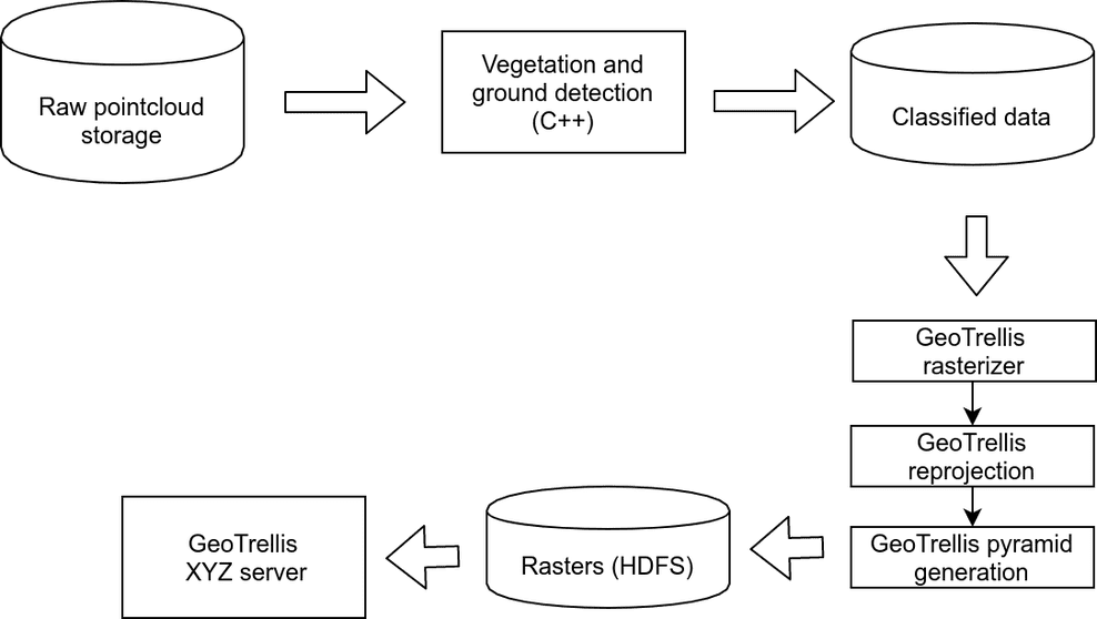
To overcome these challenges, we decided to create a rasterizer pipeline suitable for running on the Infrabel HDP cluster by using Apache Spark and GeoTrellis. While we know Apache Spark, using Geotrellis was new for us. Luckily, we got great help from the GeotTrellis community in getting our problems sorted out.
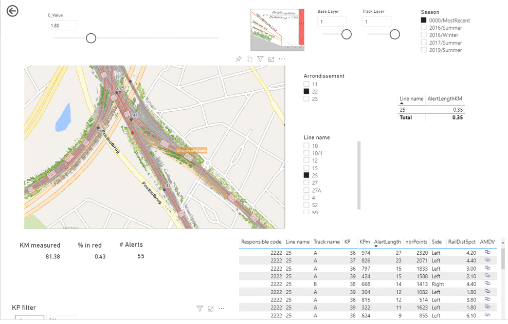
We built a small GeoTrellis-based XYZ tileserver and enabled dynamic recoloring of layers and data selection (e.g., to compare the evolution of vegetation between two seasons).
Our visualization already made it possible to find the worst spots in the blink of an eye, but they were still raster images. As such they were not suitable for querying, putting in a workflow system or creating statistics. We needed results that can easily be consumed by a BI system to create drill down reports, KPIs and even print-outs.
We built another Apache Spark based pipeline that grouped the offending vegetation in clusters of a couple of meters length.
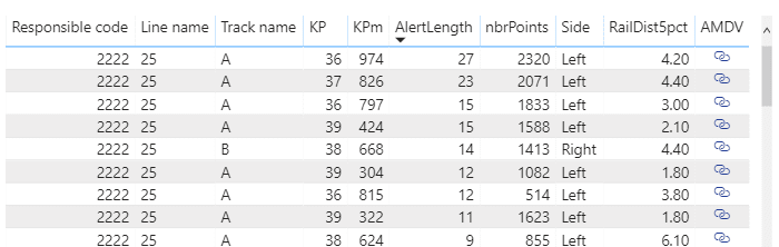
In order to enable fast drilling into the data, we used Power BI to create a report that shows both the raster data and the alert clusters in a unified way.
The built-in Power BI map component does not support the features we needed for this project, so we ended up creating a Power BI custom visual using the ESRI javascript API. This enabled performant operation, completely integrated with Power BI’s filtering capabilities: changing the filter criteria in Power BI updates the map in real time.
Subscribe to our newsletter and stay up to date.